Sanctuary by SFM Carr is a paranormal romance novel. My client, Balancing Planet Pictures, was the publisher and hired me to make a full book cover layout. Over the course of a few months, I created the illustration, typography, and layout with Procreate and Adobe Creative Suite.
Process
I started out with a rough sketch (in Procreate) using the character descriptions and inspiration the author gave me. Originally, the main male character was to be sitting at the front of silhouettes of the female characters.
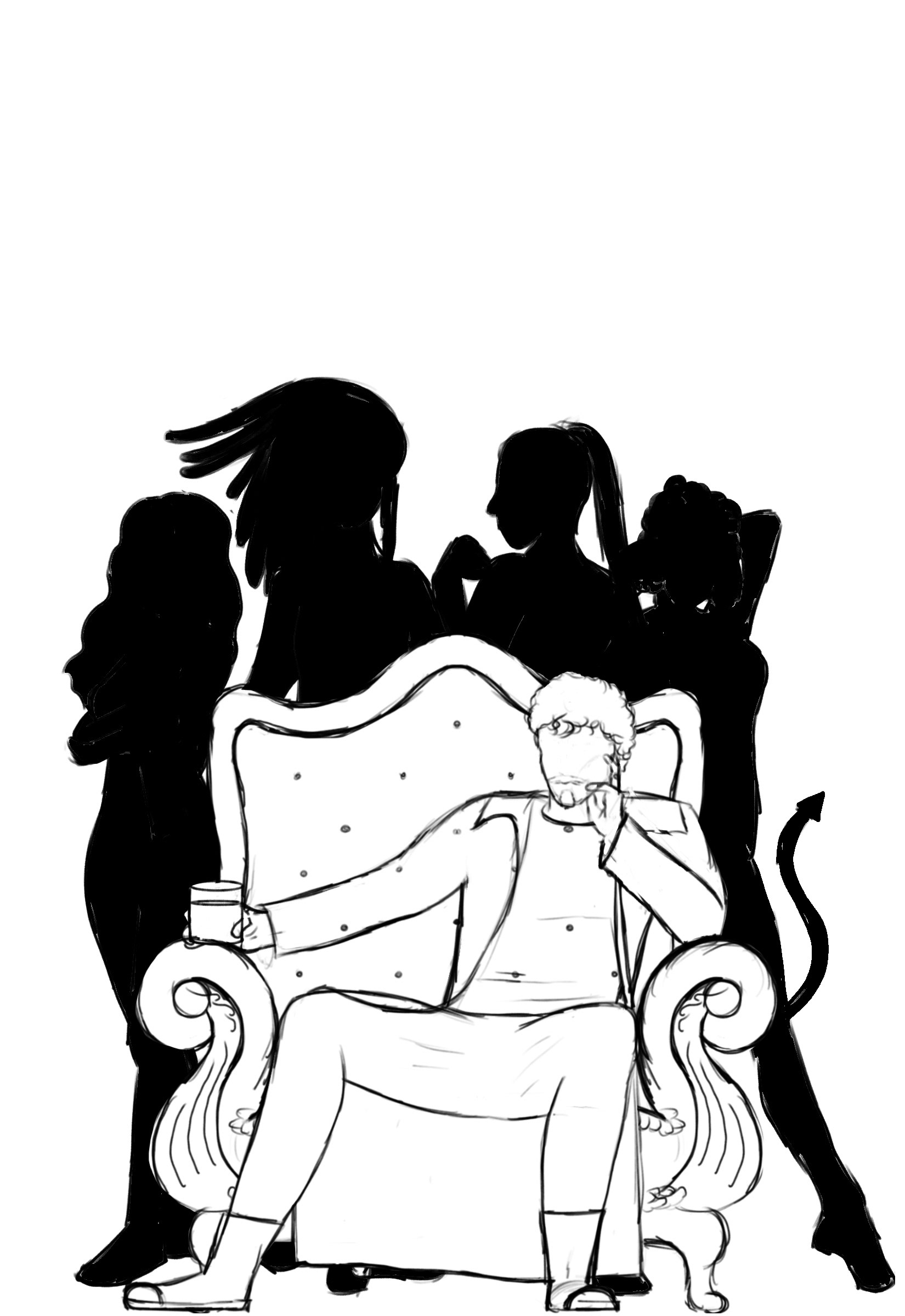
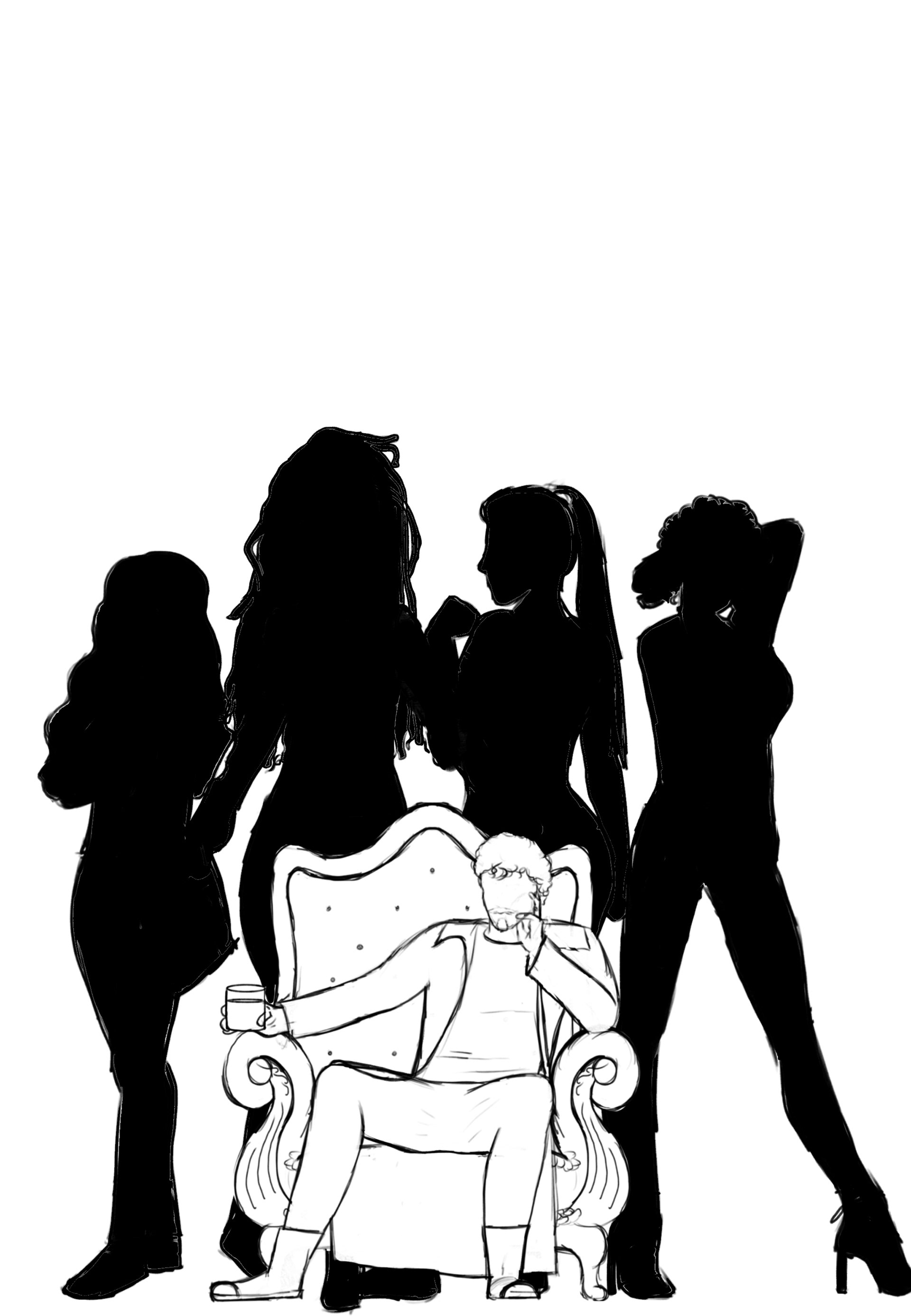
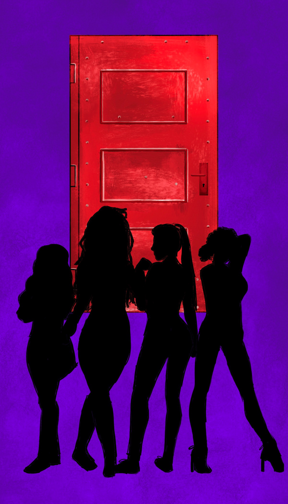
During the rough sketching process, the other decided to remove the male character and keep only the silhouettes. A door, symbolic and important to the story was added behind them instead.
After agreeing on the sketch, composition, and color palette, I began experimenting with type for the title in Adobe Illustrator. I experimented with different fonts that felt fantastical and romantic and tinkered with the text characters in Illustrator.
The author and publisher selected #1
After selecting the title font and stylizing it with shadows and light embossing in photoshop, the cover was beginning to come together.
At this point, the author wanted a tree, important to the story, inserted into the silhouette of the women. At first, this stumped me as I thought adding a tree inside such narrow silhouettes would lose a lot of detail on both aspects, but it was important that it was there, so I experimented with different ways to could work.
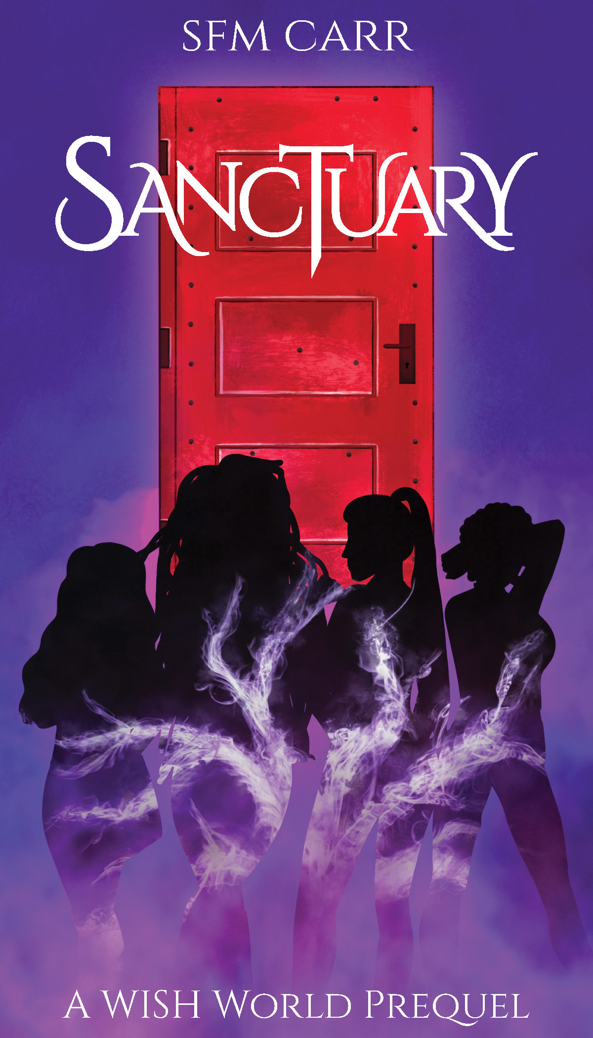
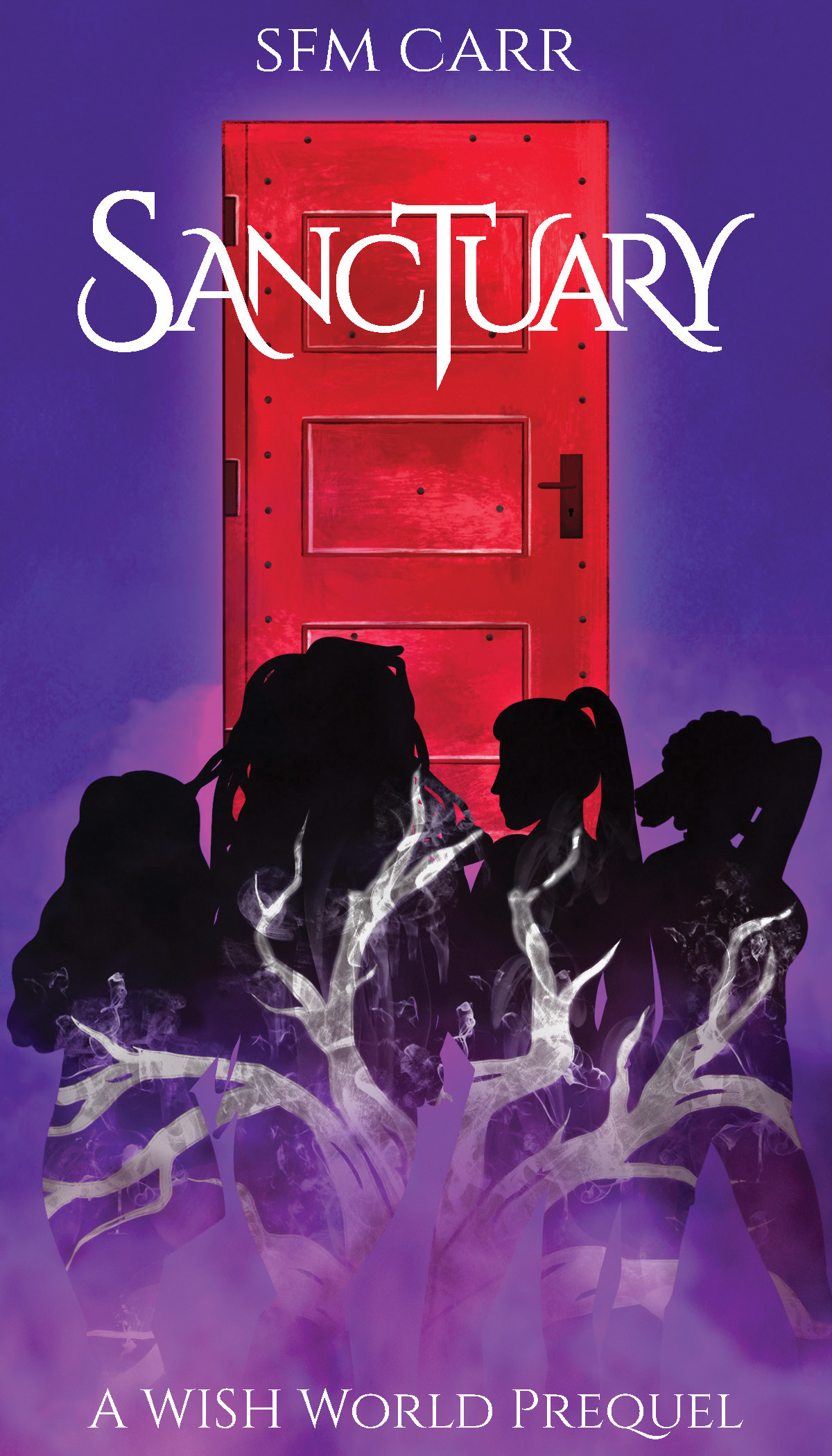
Eventually I suggested a much more simplified drawing of the tree with thin lines so it did not clash as much with the rest of the the image, and the author agreed to this compromise.
After this was done, I added shadow effects in photoshop to enhance the lighting. I then pieced together the layout of the spine and back cover in InDesign and finished the project with an animated gif version of the cover.
A vibrant, animated gif cover was required for their digital release web-page.


